12 Jan Paint Color Predictions 2021: Comforts of Home
If you’ve been thinking about repainting your home but don’t know where to start, we are here to help! Here at Amsberry’s Painting, that part of the process doesn’t have to be a challenge. With the help of color trend predictions and designer influences, we will get you up to speed on what color and color palettes may be your best choice in your next home improvement.
WHAT’S A COLOR PREDICTION?
At the beginning of every year, paint companies and designers all over the country introduce their predictions for the most popular color in the coming year. These predictions are based on paint sales, advertisement responses, and comments from customers in the previous year. As a painting contractor, we keep a close eye on these predictions in order to broaden our customer’s options when they are in the process of making decisions pertaining to color schemes.
PANTONE
As a general overall influencer of everything fashion, graphic, and design-related, Pantone takes great care in the release of their predicted color of the year. As Pantone’s influence has grown over the last 20 years, they’ve begun to contribute huge factors in shaping the color trends of nearly every industry.
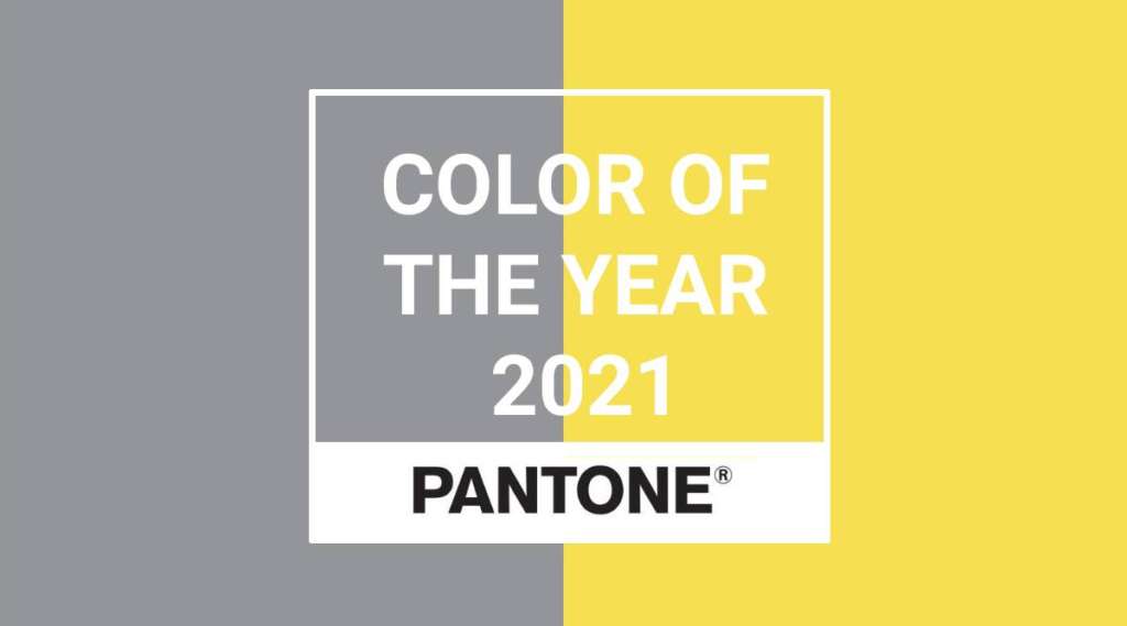
Pantone chose Illuminating and Ultimate Gray as their Colors of the Year for 2021. Pantone describes this pair as “a marriage of color conveying a message of strength and hopefulness that is both enduring and uplifting.” The vibrant yellow of Illuminating embodies feelings of optimism and warmth, while the simplicity of Ultimate Gray brings solid stability and strength.
SHERWIN WILLIAMS
One of the largest paint producers in the country, Sherwin-Williams, predicted Naval (SW6244) as it’s 2020 Color of the Year. This gorgeous, rich navy has beautifully transformed many spaces in the past year. Naval brought a bold but down to earth sense to kitchens, bedrooms, and dining rooms, as well as exteriors, as it is easily complemented by the natural colors of greenery and organic elements such as marble. As an accent or base color, you really can’t go wrong.
The 2021 predicted color takes an even more natural, earthy approach. With the tagline “rooted in nature,” Urbane Bronze (SW7048) is another rich, but more grounded color. Inspired by elements such as stones, metals, and wood, this color brings warmth and serenity to any space.
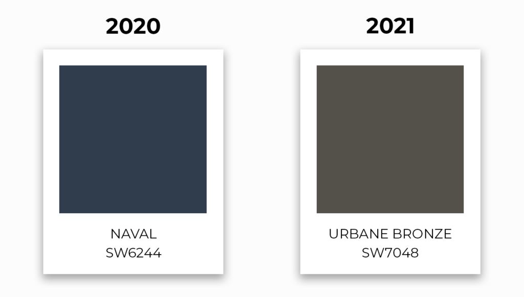
Urbane Bronze conveys an organic feel as an accent or primary color with natural elements or light-filled spaces, as last year’s color has, and pairs just as easily, if not more, with other natural shades. While not as bold in color, Urbane Bronze has its advantage as any neutral, as it can be used with a much wider range of colors from other warm neutrals to white.
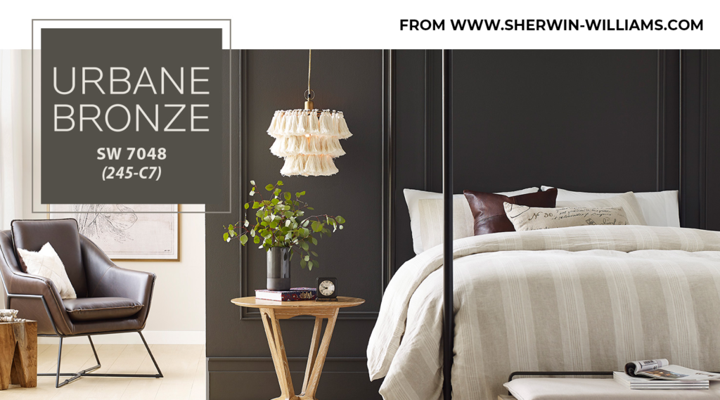
Complementary colors such as Modern Gray (SW7632) and Messenger Bag (SW7740) pair well with the 2021 Sherwin-Williams’ choice for Color of the Year.
BENJAMIN MOORE
Benjamin Moore took a much lighter approach to their color prediction by selecting Aegean Teal (2136-40) as their 2021 Color of the Year. Inspiring us to take a moment to reset, this blend of blue-green and gray is refreshing. Benjamin Moore also features a stunning color trends palette of comforting, warm, and balanced hues, consisting of twelve colors that will “make your home feel even more like home. Settle in.”
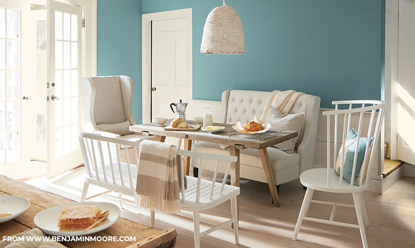
It will be easy to find a sense of calmness in this year’s paint palette of soothing and sunbaked hues. Along with Aegean Teal, complementing colors include whites and beiges like Atrium White (OC-145), Foggy Morning (2016-70), and Muslin (OC-12); grays such as Gray Cashmere (2138-60) and Kingsport Gray (HC-86); and earthy tones found in Rosy Peach (2089-20), Potters Clay (1221), and Amazon Soil (2115-30). Though Aegean Teal has the spotlight, any choice or combination of the twelve colors featured in this year’s palette will create a natural harmony.
HGTV
Home designers have also been weighing in their own opinions of the direction they see color trends heading. HGTV teamed up with Sherwin-Williams to produce their own line of paint, which may be found at Lowe’s. HGTV Home released a 2021 color collection called Delightfully Daring: HGTV Home by Sherwin Williams, a “rich, yet airy” color collection consisting of nature-inspired hues ranging from jewel tones to lighter hues. Their 2021 Color of the Year Passionate (#HGSW2032) is a bold but warm red, reminiscent of a “rustic red wine.”
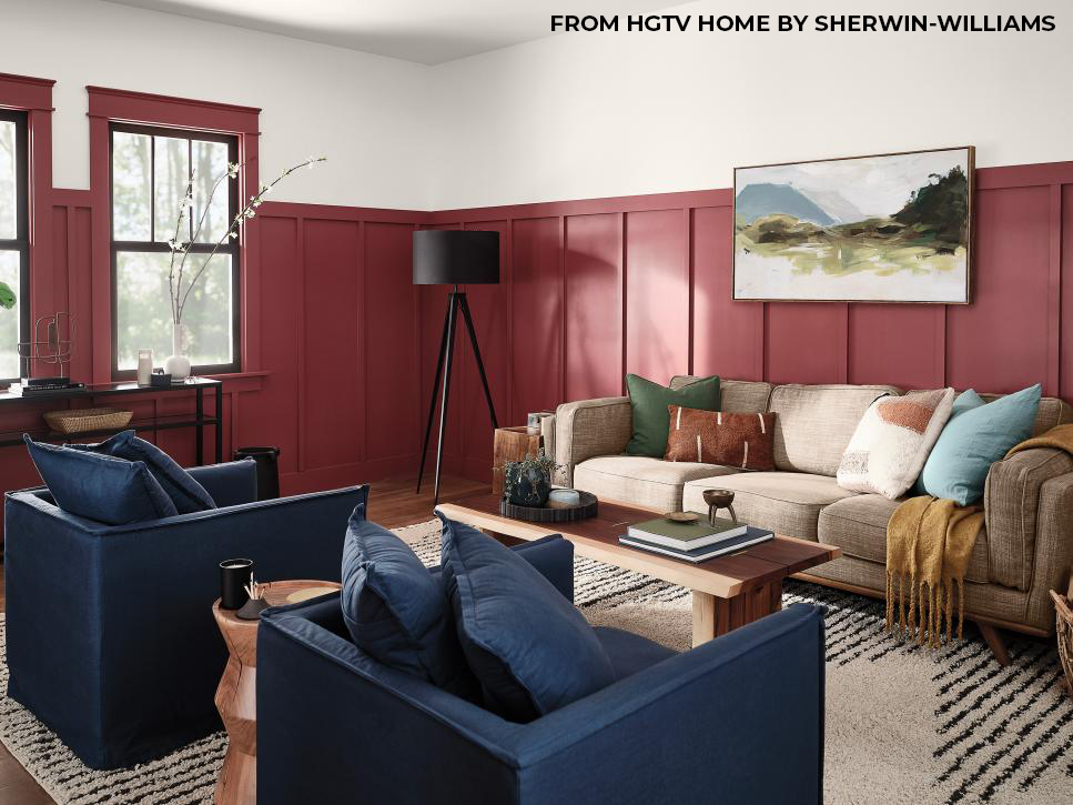
Also featured on the Delightfully Daring Color Palette:
- Dark Bronzetone (#HGSW2501) // a deep brown
- Diamond Weave (#HGSW3166) //a neutral tone
- Bohemian Lace (#HGSW4052) //a beautiful off-white
- Long Horizon (#HGSW2371) //a deep blue
- Pale Apricot (#HGSW1126) //a gorgeous blush blending of pink and light orange tones
- September Skies (#HGSW1333) a teal hue
- Breezy Aqua (#HGSW1335) //a bright blue shade
- Cloverfields (#HGSW2302) //an earthy green
- Copper Kettle (#HGSW2121) //a warm, wooden & gold tone
Though their palette consists of more vibrant and lighter colors than Sherwin-Williams and Benjamin Moore, HGTV Home stuck with the “comforts of home” theme, which is not surprising after the year we’ve had.
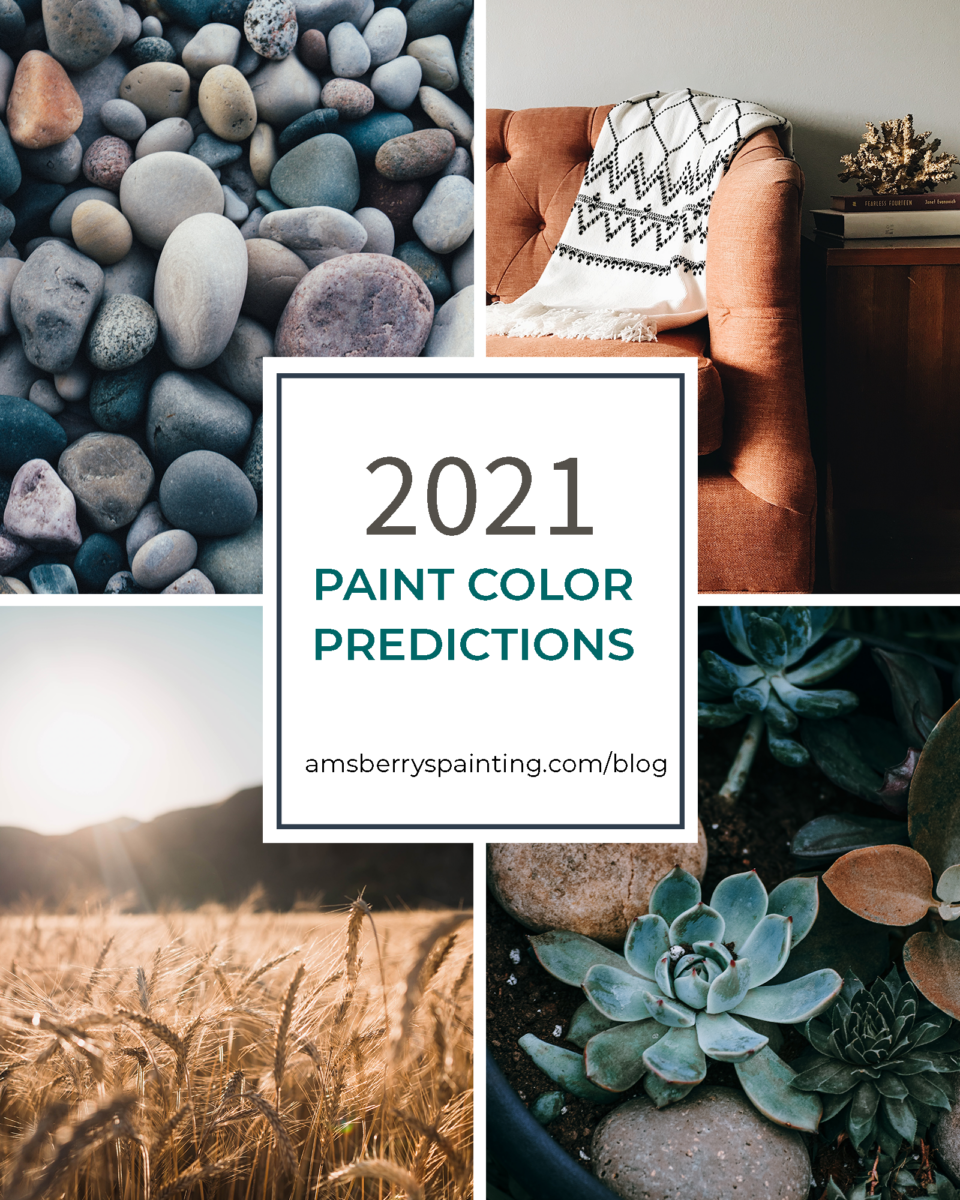
Overall, it seems designers are moving away from bright, more shocking, or obscure colors in their predictions for the next year. Paint producers and designers agree: 2021 is predicted to be a year of cozy, warm, earthy, natural tones and hues that bring us back home.
CONCLUSION
The purpose of annual color predictions is to help inspire homeowners and clients in their renovation projects in the coming year. If you’re considering repainting in the coming year, book a free estimate through Amsberry’s Painting. We provide color consultations and samples, both of which are amazing resources for finding your perfect color. Either way, comment below your New Year’s resolutions — we’d love to hear them!
Schedule an Estimate
 Writer Bio: Crystal Amsberry
Crystal is the Lean Management Assistant at Amsberry’s Painting. She loves leading a high school youth group at her church, calligraphy and design, music/musical theatre, hiking, and enjoying all the PNW has to offer.
Click on the graphics below to check out more of our blog posts! To see more color palettes like these, head over to our Pinterest page!


