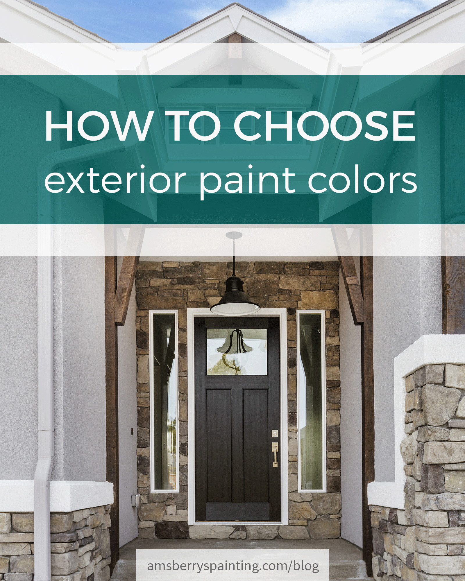
16 May How to Choose Exterior Paint Colors for Your Home
Summer is in full swing, and with that comes family vacations, road trips, afternoons in the great outdoors, and collecting sand that will never fully come out of the bottom of the car. In the painting world, it’s our busiest time of year for a reason – it’s the perfect time to repaint your exterior. But when it comes to choosing an exterior color, things can get pretty overwhelming. This year, there have been some revolutionary changes in the realm of exterior design, and we’re hoping they’ll make your color choosing process a little more freeing.
At the beginning of every year, paint manufacturers pull together their resources to produce a color forecast for the upcoming year. Within this forecast are generally 3-6 palettes of colors that the company predicts will be used by painting contractors and homeowners that year. Most companies have two sections of their forecasts: One for interior, one for the exterior.
A rather common theme in many of this year’s color forecasts is that neutrals are being replaced by slightly more subtle color hues. In the past, homeowners have tended toward sticking with safe colors such as blue, taupe, and white, but are now finding a little more boldness in these still classic colors. These ideas are reflected well in the color forecasts and palettes of two of the world’s biggest paint manufacturers, Sherwin Williams and Benjamin Moore.
An important thing to remember when choosing your exterior colors: you are making a lasting statement. With that in mind, you’ll want to go with a color scheme that is classic in design, will last through years of weather, and is true to your personality and color preferences.
COLOR CHOICE
The color choices that are popular this year just so happen to be absolutely perfect for the Pacific Northwest. With our routine weather patterns, it’s important that we pick colors that won’t fade easily or look garish in our green setting. With those two things in mind, pale colors and dark muted tones are excellent options.
Earthy, rich colors are also great options – they blend well with the natural environment of Western Washington, they age well, and give off an air that is both classic and unique. Included in the Unity palette by Sherwin Williams are also some bold, bright colors that make great accents against such muted tones.
Soft, earthy pastels have also slipped into style, and they’re proving both earthy and durable. The faded look of these tones is a great option for an exterior due to the fact that since they’re already faded to a nice pigment, any other fading due to sun exposure would be very subtle. These pastels go beyond the stereotypical into simple yet beautiful shades that invoke a tasteful atmosphere.
Overall, when choosing an exterior color it’s very important to pick a color that will withstand the test of time, a color that you’ll continue to love through the years.
FUN FACT
In the early 1800s, when house painting was all necessity with minimal consideration for color and design, paint came in two colors: White for houses and red for barns. Now, aside from the thousands of pre-tinted options presented by paint manufacturers, the average paint store is able to create custom color matches off any color sample that a homeowner can give them!
FORM
Interestingly enough, while exterior color trends ebb and flow with every season, the basic exterior form hasn’t changed much over the years. For as long as many in the home-improvement and construction industries can remember, the exterior format has been very basic: Dark body color that provides good coverage for the siding, white trim, and maybe a door or shutter accent if you’re feeling bold. Over the last few years, however, that boldness has taken over and people have started doing their exteriors in slightly different ways.
ACCENT TRIM
Within the last five years, people have become increasingly fond of using their trim as a true accent, rather than a staple white. In many cases, people have chosen to go with a neutral beige or white as their body color paired with a fun, bold color for their trim. In others, they’ve made the stylistic decision to have the body and trim on their house the same color! Rather than sticking with tradition, people have begun to treat trim painting as an opportunity to make a statement that reflects their personality.
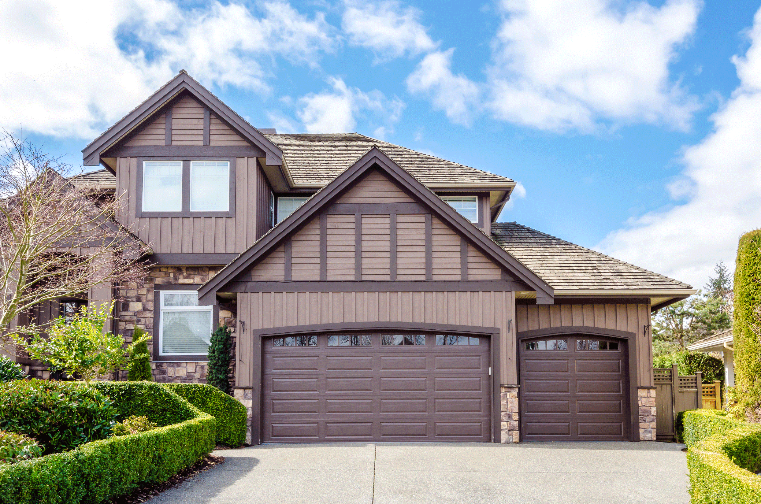
BODY
A trend that we’ve noticed in the last few years is the idea of unconventional body colors. Rather than the default white, blue, or beige that has been popular in the last several years, people are tending to move more toward other options such as red, green, and dark gray. These still classic yet considered unconventional body colors are a great option for those who want to make a striking impression without the maintenance that comes with selecting a bright color.
GABLES
In the midst of choosing exterior paint colors, one mustn’t forget about their gables. While gables can be seen as more of a hassle than a blessing due to the maintenance required to keep them beautiful, there are a lot of options as far as what to do with gables. The most popular option is to use a semi-transparent stain, which adds an element of natural wood to the exterior of a house that isn’t normally present. The lesser-known option is to go with a solid stain – which lasts 2-4 years longer than semi-transparent – and to entirely change the color of the gables themselves. Solid stain is more of a paint-like product, while semi-transparent is either completely clear or close to it. The solid stain really allows you to play around with different color options: Coat it the same color as your siding, make it an accent slightly lighter than the body color, or choose a completely different spectrum by making it a dark accent.
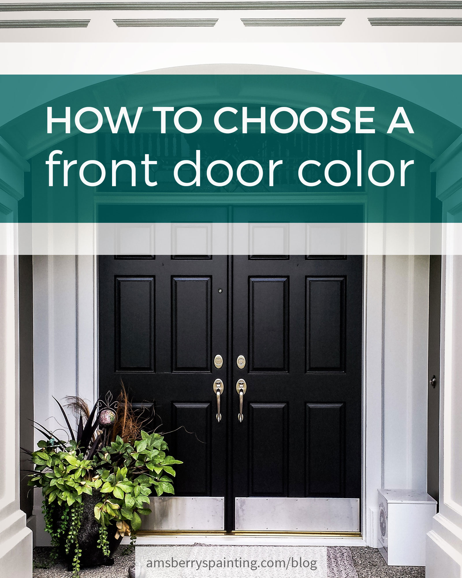
DOOR
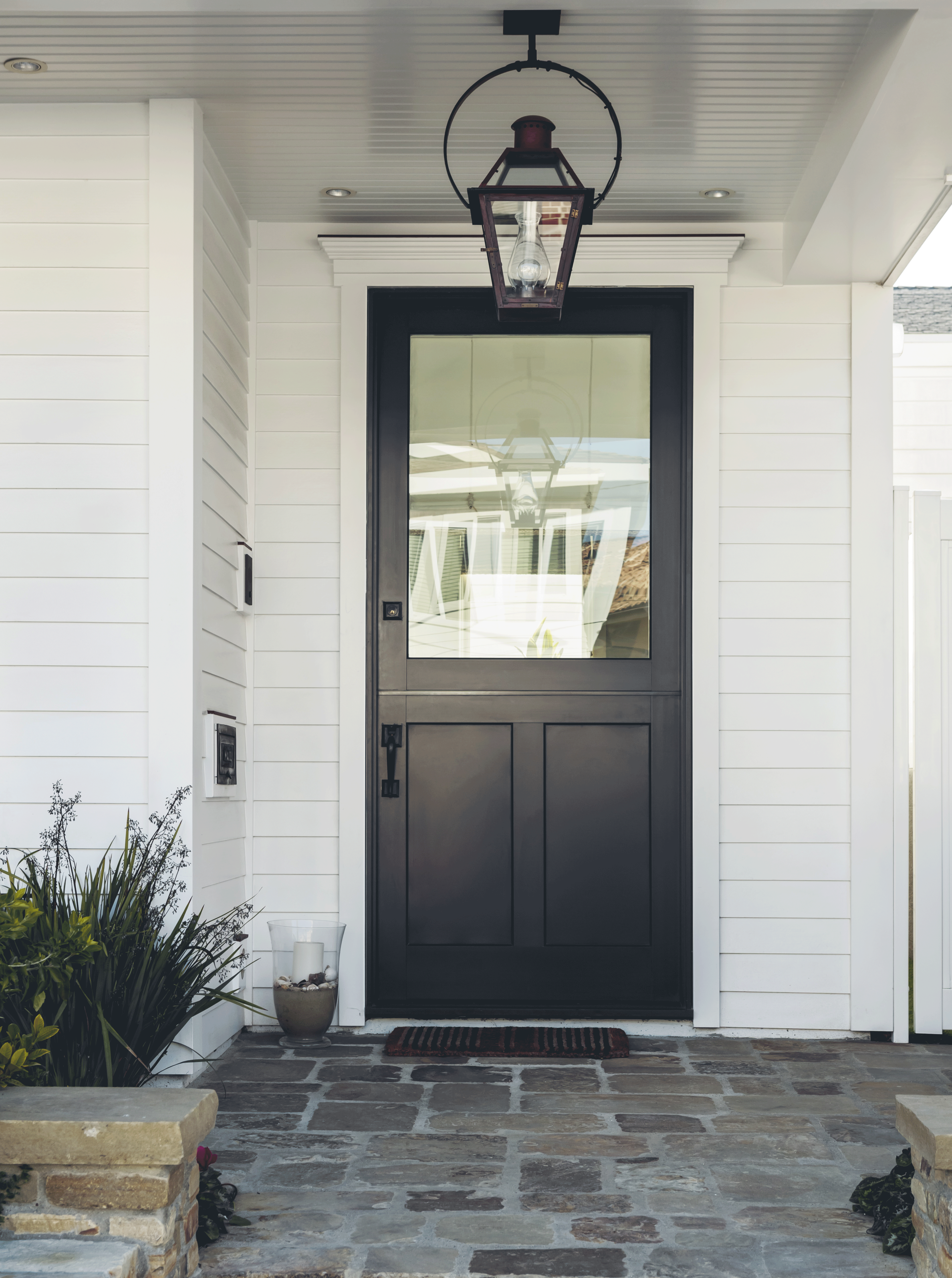
Detail-oriented doors are a very simple and popular way to tie together the details of an exterior painting project. A subtle door blends in beautifully with a cohesive color scheme, while an accent door adds a pop of color and individuality that may not have been present otherwise. Door colors that don’t match the siding are a timeless choice and provide even more freedom to the homeowner in the decision making process than siding and trim do. Door color is something to consider with care, but also with freedom. Red doors are timeless, yellow doors are especially popular this year, and the few blue doors we’ve seen have been stunning!
Consider even a light body color and a dark door color. It still allows the door to act as an accent, but as a contrasting factor of a dark color, rather than a bright one. Such a contrast can add a lot of interest to the color scheme of your home.
THE BOTTOM LINE
No matter what colors you choose in the end, remember that your choices are for your home and they should be true to that. Allow your colors to emulate what you’ve always wanted, regardless of color standards or trends. Here at Amsberry’s Painting, we are committed to delivering quality service to meet our customer’s preferences. It’s not too late to paint your home this summer – book your free estimate now!

Writer Bio: Ellen Coy
Ellen is the Office Assistant, and resident blogger, at Amsberry’s Painting. She loves reading, writing, photography, and The Pacific Northwest. She can usually be found with a cup of tea.
Click on the graphics below to check out more of our blog posts!